17 décembre 2009


Introducing Google Browser Size

When I started work at Google, I visited the Google Earth team, hoping to find a 20% project on my favorite Google product. There I met Bruno Bowden, who introduced me to a problem I had never thought much about: how to take browser sizes into account when designing a page.

Bruno had noticed that many people who visit the “Download Google Earth” page never actually download, even though, as you can see, the button is pretty hard to miss:


He wondered if a significant number of users might have their browser windows too small to see the button:


To analyze this, Bruno looked at how large people's browser windows were when they visited this page. His first key idea was to measure not the entire browser window, but just the client area -- no toolbars, status bars, or other chrome.

Bruno's second key idea was to render several weeks' worth of page visitor browser sizes in a contour visualization:


Using this visualization, Bruno confirmed that about 10% of users couldn't see the download button without scrolling, and thus never noticed it. 10% may not sound like a lot, but in this context it turns out to mean a significant number of people weren't downloading Google Earth. Using this data, the team was able to redesign the page to good effect.

Bruno and I realized that Web designers might benefit from this information if it could be made more generally available. We constructed a page that could overlay a DIV containing the contour visualization atop an IFRAME containing any other Web page:


This turned out to be a good way to see which controls were and weren't visible at typical browser sizes. The only problem was, the overlay DIV prevented mouse events from getting to the page IFRAME, so it wasn't possible to interact with the page.

To solve this, we split the overlay DIV into four:


Each of the outlines above (red, yellow, blue, green) represents a separate DIV. As the mouse pointer moves, we resize and reposition the DIVs to leave a small window of blank space around the pointer, and adjust background offsets for each DIV to make the overlay look like one seamless graphic. (We originally did this on a timer, but we found a simpler way: when the mouse touches any of the DIVs, resize/reposition all of the DIVs.) End result: a designer can click and otherwise interact with the page with the mouse, and thus interact with the site normally instead of repeatedly typing in URLs.

We are now making this tool available to the public on Google Labs. To try it, simply visit browsersize.googlelabs.com and enter the URL of a page you'd like to examine. The size overlay you see is using latest data from visitors to google.com, so this should give you a pretty good indication of what parts of your UI are generally visible and what aren't.

We look forward to receiving your comments at browser-size-external-feedback!


16 décembre 2009


Ce que nous réserve CSS3 en 2010

L'écriture des spécifications CSS progresse à grands pas, et la version 3 comporte déjà plusieurs modules implémentés dans les navigateurs récents. L'année 2010 verra certainement nos habitudes changées par les nouvelles possibilités offertes en CSS 3. D'ores et déjà de nombreuses utilisations concrètes voient le jour.


Vous pourrez constater l'état d'avancement des différents modules CSS sur la page récapitulative Cascading Style Sheets : Current Work.


Des coins arrondis


Du Web 2.0 avec style

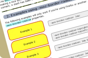
La propriété border-radius arrondit les angles de n'importe quel élément HTML, sans avoir besoin d'images ni de JavaScript.


Using Rounded Corners with CSS3 (EN)


Créer des coins arrondis en CSS et sans images


CSS: border-radius and -moz-border-radius (EN)


La gestion de l'opacité


La transparence enfin maîtrisée !

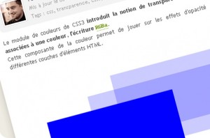
L'interprétation des images transparentes en PNG (24 bits) est une première délivrance pour les web-designers qui pourront mettre en œuvre plus de créativité. La nouvelle notation des couleurs et de la gestion intégrée de leur transparence (RGBa) va être une seconde avancée significative.


CSS3 : la transparence de couleur avec RGBa


CSS3 opacity : transparency of an element in css (EN)


Les arrière plans multiples


Elle n'est pas (plus) belle la vie ?

Grâce aux nouvelles valeurs multiples utilisables dans la propriété CSS background, il sera désormais possible d'appliquer plusieurs images d'arrière-plan sur le même élément, sans devoir en imbriquer plusieurs.


Arrière-plans avec CSS 3 Backgrounds


Le multi colonage


De la P.A.O. sur le Web ?

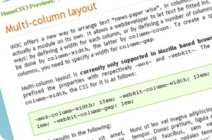
Les propriétés column-width et column-gap vont générer une mise en page sous forme de colonnes multiples, où le texte va s'écouler automatiquement d'une colonne à la suivante.


CSS3 Multiple Columns (EN)


Multi-column layout (EN)


Les ombrages


Nul besoin d'un surcroît d'images

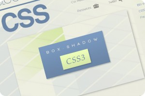
La propriété box-shadow crée un ombrage solide ou dégradé sur tous les éléments HTML.


CSS3 box-shadow property (EN)


Les ombrages en CSS3


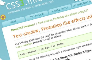
Des effets sur le texte


Les CSS3 concurrencent les styles Photoshop ?


Les ombrages en CSS3


Text-shadow, Photoshop like effects using CSS (EN)


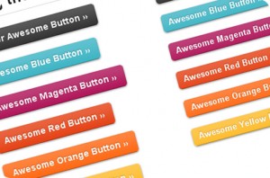
Des boutons esthétiques


Arrondis, dégradés, animés.

L'association de plusieurs propriétés CSS3 permet de concevoir des boutons de lien d'une esthétique irréprochable sans utiliser d'images.


Super Awesome Buttons with CSS3 and RGBA (EN)


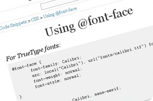
Les polices exotiques


Les polices web-safe ne sont plus seules.

@font-face permet d'incorporer des polices externes et variées.


Using @font-face (EN)


21 Awesome @font-face Embeddable Typefaces (EN)


Les dégradés


Un peu de douceur dans ce monde uni.

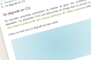
De nouvelles propriétés gradient permettent de réaliser et gérer des arrière-plans de teintes dégradées.

degradé-css
Arrière-plans avec CSS3 Backgrounds


Des animations


E pur si muove !

Grâce aux dernières évolutions du langage et au module Transitions, il est désormais possible de réaliser des transitions basiques.

transitions-css
Transitions CSS3


Les sélecteurs


La fin de la Divite et de la Classite chronique ?

Les nouveaux sélecteurs CSS3 vont faciliter le nommage des éléments particuliers (le second de la liste, les lignes impaires d'un tableau, ...).

selecteur-css
CSS 3 selectors explained (EN)


Conclusion


CSS3, couplé à HTML5 (ou pas), va permettre de réaliser des effets réservés jusque-là à JavaScript ou aux découpes d'images contraignantes (ombrage, survol, arrondis...). Si on ajoute que jQuery et les autres frameworks commencent à s'imposer dans de nombreuses applications web (diaporama, interface cliente riche...), l'année 2010 sera mouvementée ! Bien entendu, il est important de rappeler que certains navigateurs n'ont pas encore implémenté l'ensemble de ces fonctionnalités.


Pour aller plus loin (en anglais)


15 décembre 2009


Memory Fox Flushes Firefox’s Memory Constantly


Some Firefox users feel that the web browser has grown into the wrong direction lately with to much bloat being added to the web browser. The computer memory usage of the web browser is one of the factors that they use to make their point although studies show that memory usage actually decreased in Firefox 3 when compared to Firefox 2. Still, the memory usage of the browser can reach hundreds of Megabytes in no time and it seems that grows with every passing minute but fails to decrease to the initial starting memory usage.
Memory Fox is a memory optimizer for the Firefox 3 web browser. It is only offered for the Windowsoperating system and can be used to constantly flush Firefox’s memory usage.

Memory Fox, focuses on two ( 2 ) types of memory usage and with flushing for memory recovery. When resource requirements ( Stack and Heap ) have been reached, according to the user’s preset option settings, the memory will be flushed and recovered from Fragmented OrphanedRam memories.

memory fox
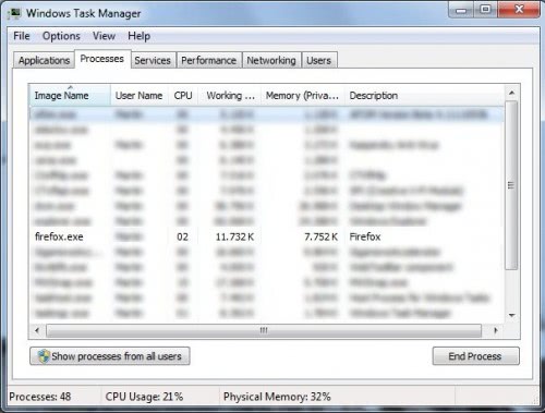
Memory Fox needs to be activated after installation which can be done in the add-on’s options or from the status bar icon. Activating of the memory optimizer results in constant drops in the memory usage of the web browser which can be observed in the Windows task manager.
firefox memory usage
The extension manages to keep the memory usage of Firefox 3 below the 100 Megabyte mark most of the time. This does not result in measurable speed improvements but it might be helpful if the computer system is not equipped with lots of RAM.
Memory Fox can be downloaded from the add-on’s Mozilla Firefox profile page.

9 décembre 2009


Apple Announces iPhone Developer News RSS Feed

http://www.iphonealley.com/current/apple-announces-iphone-developer-news-rss-feed

Faster apps for a faster web: introducing Speed Tracer

Do you ever wonder what's going on inside the browser when a webpage doesn't load or respond as quickly as it should? Many developers do, especially when trying to build powerful web applications for their users.

But up until now, it's been difficult for developers to identify problems in a slow-to-respond application. So, tonight at Google Campfire One, we're happy to announce that we're adding a new tool to Google Web Toolkit called Speed Tracer.

Speed Tracer is a Google Chrome extension that enables developers to identify performance problems in their web apps using a "Sluggishness Graph," in combination with many other metrics. In the spirit of clean, simple design, developers need only look at the Y-Axis of their application's Sluggishness Graph to see how they're doing:
  • If the y-axis is close to zero, then the app is fast
  • If the y-axis registers around 100%, then the app is, well, sluggish
And in either case, Speed Tracer provides lots of additional data to help diagnose any particular performance issue.

More @ http://googleblog.blogspot.com/2009/12/faster-apps-for-faster-web-introducing.html

7 décembre 2009


10 Useful Website Management and Testing Tools


LoadStorm

load_storm
This web based load testing tool to check web performance of your website. You can create as many test plans, scenarios, and steps as you need. Tests can be built using the tool in such a way as to simulate a large number of different users with unique logins and different tasks.

SiteAnalysis

webmetrics
It also an important tool to test and validate critical website components. You can easily test and validate internal and external links, domain names, DNS servers and SSL certificates. It can be easily run as per your preference that can be as often as every hour, or as infrequent as once a week. This is best suited for dynamic sites requiring frequent link checking.

Avalanche

spirent
Another load testing tool specially designed to stress-test security, network, and Web application infrastructures by generating large quantities of user and network traffic. It emulates multiple Web browsers, supports Web Services testing Supports HTTP 1.0/1.1, SSL, FTP, RTSP/ RTP, MS Win Media, SMTP, POP3, DNS, Telnet, and Video on Demand over Multicast protocols.

VisualVM

visual_vm
This is a free tool to examine and troubleshoot Java applications. It runs seamlessly on Sun JDK 6 and also efficient in monitoring applications on JDK 1.4 and higher. Its automatically detects and lists locally and remotely running Java applications while monitoring application performance and memory consumption. It saves application configuration and runtime environment together with all taken thread dumps, heap dumps and profiler snapshots.

HTML Validator

html_validator
It is a Mozilla extension that adds HTML validation inside Firefox and Mozilla. The number of errors of a HTML page is seen on the form of an icon in the status bar while browsing. It allows you to validate the HTML sent by the server or the HTML in the memory (after Ajax execution). You can easily see Error details on the HTML source of the page for correction.

Fortify 360

fortify
This tool ensures security of your website along with vulnerability detection. It features integrate static source code analysis, dynamic runtime analysis, and real-time monitoring to identify and accurately prioritize the greatest number of critical security vulnerabilities. Its Program Trace Analyzer (PTA) that finds vulnerabilities that become visible only when an application is running and integrates into a QA test to find vulnerabilities while a functional test is being conducted on an application.

XenoCode Browser Sandbox

sandbox_browser
Another important testing before launching a website is Browser testing. This tool offers a series of virtual applications that can run all popular browsers simultaneously. It does not even require the installation of software.

W3C HTML Validation Service

w3c
This validator checks the markup validity of Web documents in HTML, XHTML, SMIL, MathML, etc. If you wish to validate specific content such as RSS/Atom feeds or CSS stylesheets, MobileOK content, or to find broken links, there are other validators and tools available.

Google’s Website Optimizer

website_optimizer
It is another testing service from Google where you can test the content and pages you want. Here you can test headlines, images, or text using our easy web-based system. The testing done through this service helps in determining impacts on conversions, user actions, traffic, or other goals.

DeviceAnywhere

device_anywhere
This is a mobile handset testing platform allows development, deployment, and testing of content/apps on more than 2000 real handset devices in live global networks around the world using just the Internet. The mobile handset bank includes devices stationed in the United States, Canada, United Kingdom, France, Germany, Spain, Japan etc.
We hope these tools will help you in launching and maintaining user-friendly and error free website. Please share with us your suggestions and feedback as always.